
Typography: An Introduction
Typography blends art and science, shaping how readers perceive written content. It predates digital type by centuries, evolving from calligraphy and movable type in printing presses.
Typefaces Versus Fonts
A typeface encompasses a range of characters sharing a design ethos. In contrast, a font refers to variations within a typeface, such as weight, style, and size.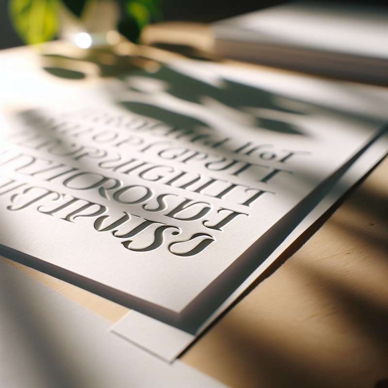
Serif vs. Sans Serif
Serif typefaces feature small projecting lines, called 'serifs', at character edges. They enhance readability in print. Sans serif typefaces lack these lines, offering a cleaner look suited for digital screens.
The Invisible Anatomy
Each letter's shape is defined by 'anatomy': baseline, x-height, ascender, descender, and more. Surprisingly, the 'counter', the space inside letters, greatly impacts legibility.
Legibility vs. Readability
Legibility measures how easily individual characters are distinguished. Readability assesses how text layouts facilitate effective reading. Both are critical for effective typography.
Typography's Emotional Weight
Typography conveys mood and tone through font choices and styling. It’s subtle, yet a Gothic font can evoke eeriness, while a script font might suggest elegance.
The Power of Kerning
Kerning adjusts the spacing between characters, impacting readability. Poor kerning can create unintended words or distractions, while well-kerned text promotes a seamless reading experience.
What does typography blend?
Art, science, and perception
Color theory and textures
Digital media and print
Company